Why Word Wrap Graphic-Text Interaction brings Value to Book Layout
During book layout, the value of graphics that interact with the content’s text via intricate word wrapping frequently gets overlooked. This is especially true of people who have an old-fashioned approach to layout. They are not accustomed to — or do not approve of — tight graphic-text interactions.
But what, exactly, is the value graphic-text interaction brings to a project?
Understanding Graphic-Text Interaction via Word Wrap During Book Layout
The whats and whys of graphic-text interactions during book layout relate back to how readers perceive things and input data. Eye tracking studies reveal that simple things like page placement and spacing can dramatically affect how we notice certain content components. These elements also influence how we associate components as a part of the whole.
You detrimentally affect readability if you place content — be it graphics and/or text – too close together. The two or more content components are perceived together, muddying their meaning and importance. Place these elements too far apart or with too much or incorrect padding around them, however, and you get the opposite effect. There is no or little-perceived connection between the components in such cases.
When Clients are Their Own Worst Enemy
I have one layout client in particular who absolutely refuses to allow any tight word wrapping around graphics. For example, let’s say there is a circular infographic they want in a newsletter. They will not allow any layout that wraps the accompanying text around that circle’s edge. Instead, they demand the text either wrap around the circular graphic as though it were a square box or that it is segregated from all text using no word wrap. This policy is rooted in the client’s personal preferences rather than any functional reasons. They just won’t consider any reason or circumstance to counter this policy.
This approach is aesthetically old-fashioned and a remnant from a time when tight word wrapping was difficult to deploy. (Some people still have trouble with it even using leading layout software.) Such preferences also distance the content components and hinder engagement because the images and text are not interacting effectively or efficiently.
Getting the Most Engagement out of Content Interaction via Word Wrap
To illustrate how weak content interaction can ruin a reader’s engagement with the material, and how it affects basic aesthetics, let’s look at the two approved word wrap methods the previously mentioned client will allow for their book layout projects. (Keep in mind the images were all created quickly as examples, so there’s no tweaking or refinement one would expect in an actual project.)
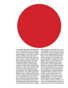
Total Text/Graphic Separation Layout
The first image is one of the options this client permits that I prefer. Although it still creates a degree of disconnect between the graphics and text components, it is aesthetically the most pleasing. It places the graphic on its own (in this instance it is atop the text, although it can also be placed in the middle of after the text). This graphic placement has no word wrap at all — it forces the graphic into isolation from the text. Still, the reader’s eye still moves directly over the graphic as it moves on to read the text, so it is still very likely the reader will take note of the graphics and find leads within the text itself that will connect the two.
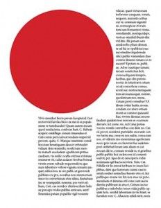
Side Column Text/Graphic Layout
The second method this client approves of is one I try to avoid at all costs. Despite their opinion, I think many of you will agree this technique looks sloppy. The text wraps around the graphic’s extreme dimensions as though it were a box. The most likely point of interaction and engagement between the graphic and text is at the circle’s relative extremes. However, the awkward white space at each corner of the “box” this creates is far more obvious. As a result, the chance of dissociation between the image and the accompanying text increases.
And, really … that squared off white space around a curving object just looks bad. It is a hole in your page that wastes space.
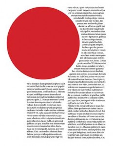
Wrapping Text Layout
The third image is an example of how I prefer text interact with images. The text shapes itself along the circle’s contours, leaving uniform padding between graphic and text. The way the curved edge interacts with the rightmost column also forces the eye to engage with the image as one reads. This happens because the image is pushing into the reading space. You simply cannot read the text without your eye noticing the image. This image reflects a proper way of getting graphic-text interaction to result in engagement during book layout.
I know it is been a while since I’ve updated this blog. I’ve been extremely busy with my day job, freelancing, and publishing. However, I hope to get back to a regular posting schedule in 2016. I hope this will include more tips and comments on book layout you can enjoy.


