
Hello, stock art, my old friend
To begin, let’s define what stock art actually is. They are individual art pieces or collections that can be bought on a royalty-free or rights-managed basis you can then use according to their license’s terms. Permitted modifications (if any) and prohibited products (e.g., “adult content”) are common licensing conditions. This is the upside. Stock art is bought “off the shelf,” so to speak, meaning it’s not tailored to the user’s unique vision. That’s the downside.
Stock art is a resource I’ve made good use of for over fifteen years. I’ve used stock art in products as a publisher and as a Gamemaster looking for visuals game aids. Since about 2014, I’ve also represented numerous artists by marketing and selling artist-owned stock art on their behalf. And what have I learned about the process of stock art creation in that time? A number of things, one of which I’m going to talk about here: preparing stock art for the customer’s needs.
The intent isn’t always “stock art”
My experience is that a lot of stock art doesn’t start out with that intent. Most are art pieces originally created for other purposes, including for:
- clients, but the project fell through or payment wasn’t sent. Artists retain the rights in such instances.
- display in the artist’s portfolio.
- clients under limited rights, so the artist retains rights to re-sell.
- practice.
- fun.
- selling otherwise by the artist (e.g., prints, merchandise.)
Repurposed art frequently has shortcomings as a result. Why? Because he piece had a specific purpose and design in mind when created. Art originally for a publisher who doesn’t pay is likely to have details specific to their project. A setting-specific race may appear in the art, for example, or a trademarked mecha. Customers can still utilize creativity in how the stock art is used and get around this problem, however. Art not intended for publication at all often presents what I consider to be a bigger problem when sold as stock art: project integration.
Integrating unintended stock art into a project
A publication can use stock art in a number of ways, whether it is employed on the front or back cover or in the book’s interior. But publishers/art directors pay for more than just attractive art when they commission a piece to specifications. They will specify a size, composition, and background that suits their plans for laying out their book. For example, a book planned for three columns per page instead of two requires narrow art when a column-wide art piece is commissioned. Similarly, art commissioned for books with background images or colors across the entire page will most likely require transparent backgrounds. Such details are critical when integrating art into a final product for the desired result.
Stock art obviously doesn’t allow for the opportunity to specify the particulars of any such details. With stock art, you’re stuck with the image as-is. Maybe the artist allows modifying their stock art to attain the desired end, but this isn’t always possible.
How art interacts with the rest of a publication’s components is crucial to the final product. How the art and text combine to create an interesting presentation, for example. I’ve touched on why this is important in my previous blog article, Book Layout Tips: Word Wrap — Interaction Equals Engagement. So, let’s look at how stock art (especially that which was never intended to be sold as such) can cause problems with text integration.
Let’s set the stage for art deployment
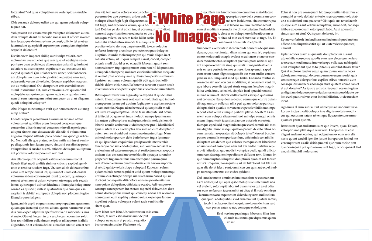
I’m going to run through a series of mockups that represent a range of possible page layouts a publisher may use. Certainly, these examples don’t represent every possibility, but they’ll serve my purpose. Before interior stock art is added, there’s going to be border art (if used) and text on the page first. Image 1 is a mock-up of such a page. I’ve used Lorem Ipsum with the border art from Odyssey Prime to illustrate how text can dynamically interact with the latter. What’s said about the border art in the following also applies to other graphic elements (e.g., charts, tables, sidebars.)
Notice how the words move around the border art as it infiltrates into the standard text columns. This looks cool but creates limitations when the time comes to insert interior art (especially stock art, as I’m going to point out.) This is the part where art director specifications are critical. Most artists (in my experience) don’t consider what I’m about to explain because the art director does that for them. So, let’s see what happens when you use stock art that doesn’t have the benefit of an art director and foreknowledge of the project it will be deployed in.
Here are the four interior art positions I’m using to make my point, presented in my full-spread mock-ups:
Common interior art deployment positions
- Position 1: Upper left (left page): Inline column. The art fits within the column and the text doesn’t wrap around it. Text is before and after the art, leaving a “box” around it that is free from text.
- Position 2: Lower right (left page): Inline column, behind infiltrating border art. The interior stock art is much like position 1 except the border art covers part of it.
- Position 3: Upper middle (right page): Column spanning. The art is placed to interact with the columns to either side of it. The text wraps around the image’s contours or the box created by its background, respectively.
- Position 4: Lower left (right page): Inline column, behind infiltrating border art. This is identical to Position 2 except the art appears over the infiltrating border art.
Obviously, there are other ways to deploy interior art but they aren’t needed for this article’s purpose.
The transparent background
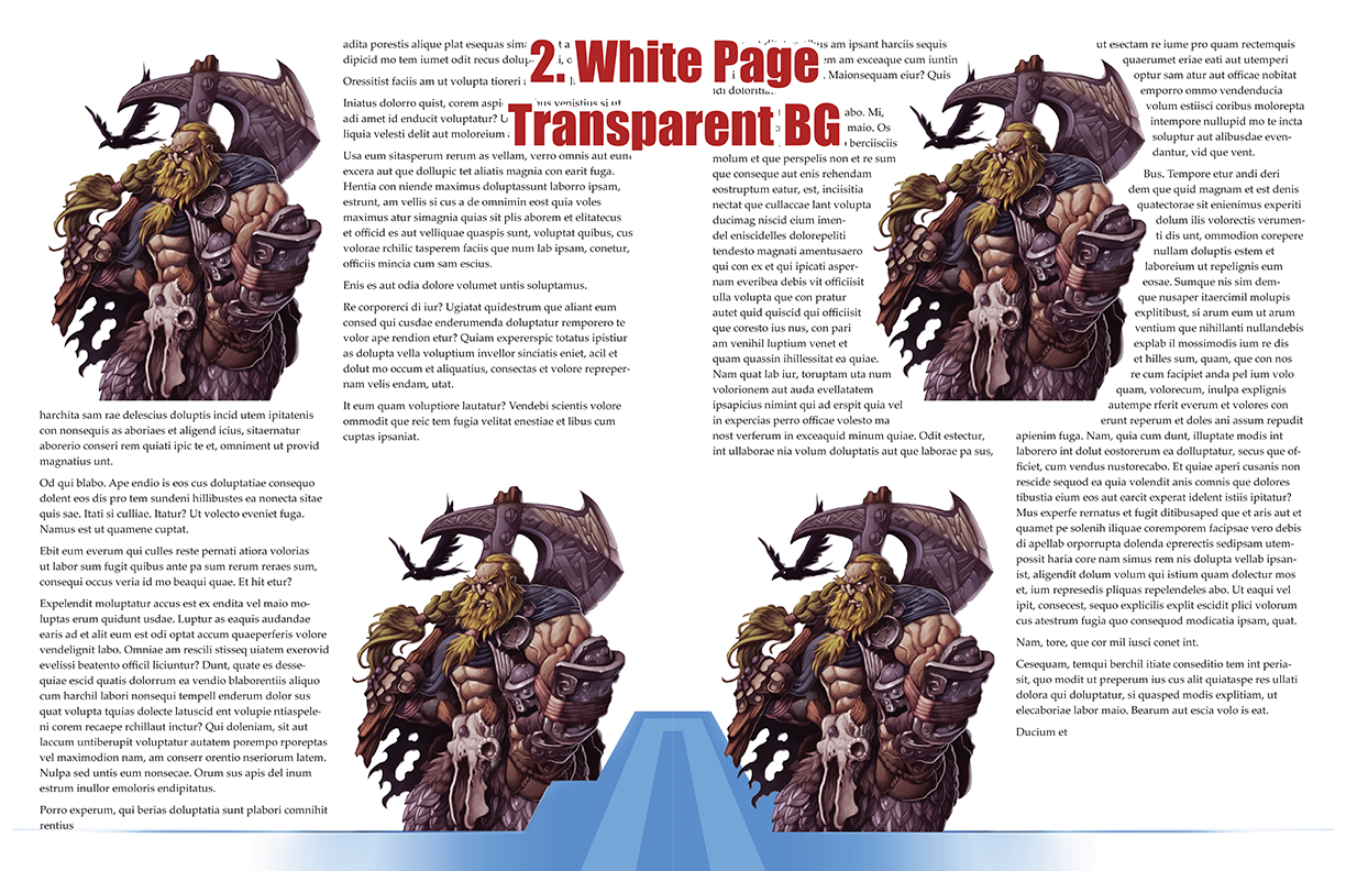

To my mind, artwork with a transparent background surrounding it is the ideal stock art product. It has the most utility, creates the fewest problems, and you can add a background of your own (license permitting) if you want one. Mock-ups 2 and 3 show how images with transparent backgrounds work perfectly with most needs.
On the white page, Positions 1 and 3 look identical to how the same art with a white background would appear. Position 2 hides some of the stock art, same as it does with every other background. Position 4 interacts with the border art without covering the latter with anything but the stock art itself. As I previously mentioned, this same effect occurs if you want the art to overlay a graph, heading, sidebar, or the like.
The same is achieved by the transparent art on a blue background page except Positions 1 and 3 appear as they would if they had a background color to match the page’s color.
I hope you see why I believe the transparent is the most adaptable and easiest to use. Now let’s see how stock art with a background color function on our sample pages.
Images with backgrounds on white pages
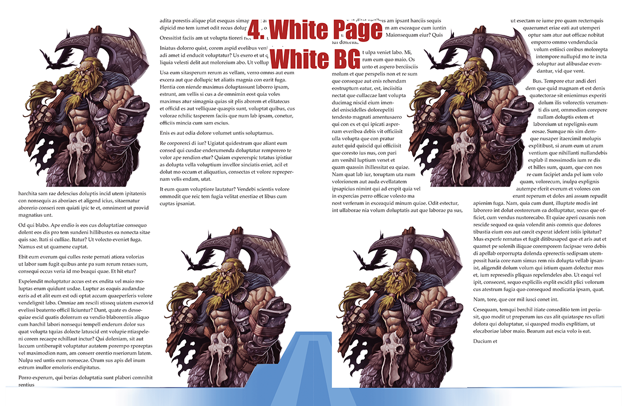

Positions 1, 2, and 3 for white paper and images with white backgrounds are identical to transparent stock art on white paper. It isn’t until position 4 that we even know that there is a white background in the images. This is because Position 4 covers up the page border. (Yikes!)
Position 3 allows the text to wrap around the image’s contours because its background is indistinguishable from the page. A square of empty white space around it, on the other hand, would look odd straddling two columns. Why not just put the image inside the column boundaries if you want to surround it with emptiness? Not so with the dark background, though.
The dark background looks best in Positions 1 and 2 because the dark square lines up with the text elements’ boundaries. Position 3 is passable (and much better if the background is a scene rather than a color), but still seems out of place compared to the text contoured around it. The dark text won’t show well on the dark background, though, and would look odd. Position 4 suffers the same issue as with the white background.
Images with backgrounds on colored pages

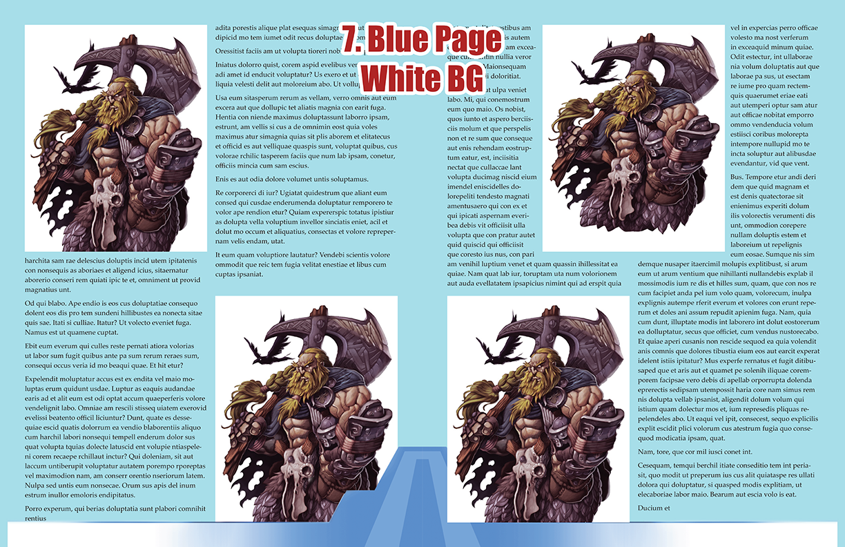
Modern publications increasingly step away from the plain, white interior page background. A design or simple, non-white color may be used. But a non-white interior background requires more thought for art deployment unless your stock art has a transparent background (see previous.)
The dark background arguably makes the art blend better with the blue page background. It communicates an intended boundary between the art and the text and page background around it. The stock art’s dark box makes the illustration stand out. (Obviously, Position 4 still suffers from the problem of overlapping the page border.)
By contrast, art with white backgrounds on a non-white page sticks out starkly in all four positions. The white background that was mostly accommodating on a white page now seems awkward and out of place even when it doesn’t overlap the page border art (Position 4.) The white background may give the impression that the choice of colors wasn’t intentional. Of course, this isn’t always the case; the white box will blend with some page backgrounds better than others. (As before, Position 4 remains a problem.)
Backgrounds that are part of the artwork
Understandably, art with a background that is more than just a color (e.g., a scene) should work on any type of page background. (Position 4 will still be an issue for the same reason as any other background.) Such a background can extend entirely throughout the piece’s “box” or it can have irregular, “feathered” edges that blend into transparency to be more dynamic. Although such backgrounds can be safer so far as layout goes, they also force the publisher into their narrative. For example, the viking stock art we’ve used here as an example can be used in many ways and genres. Put him on a background of a burning dragonboat, however, and the stock art has a story that may not fit a specific publication. Any intent to use the stock art for a “space Viking” product or as a Viking-themed superhero would be out the window.
Text-on-image and similar details reduce usability
Adding text to an image may seem like a good idea, but look at it from the customer’s perspective. Putting text that isn’t easily removed, be it on a background or character, means the customer is stuck with your choice of words. Much as with images that don’t have an easily removed background, such text limits how the customer can use the art. An image that is otherwise ideally suited for their dystopian project won’t be as appealing if inappropriate words are on a character’s clothing, for example.
Think very carefully about how text and similar specific details may limit your ability to sell a stock art piece. If it’s not essential to what you’re creating, it’s likely best to leave it out.
Balancing what’s best for the art with what’s best for sales
Creating stock art is all about balance. Make your art spectacular enough to get noticed but the less adaptable it is, the less likely it will sell. This won’t be because your stock art isn’t fantastic. It will be because you’ve reduced how useful it can be to publishers who have a vision of their own. You’re stuck with what you’ve created when it comes to repurposing existing art for sale as stock art but should put careful thought into images built for the latter purpose. Consider what I’ve said above and think about how to make your stock art as useful as possible to your customers.
Create like an artist with a vision but design like a businessperson who wants to make sales.
Misfit Studios stock art Facebook group
Want to learn more about stock art, including what other artists are creating? Looking for somewhere on Facebook to post your latest stock image releases? Join the Misfit Studios stock art hub.
Art credit: The illustration variations used in this article are provided by Douglas “Draco” Manzini. Misfit Studio sells them as “veteran Viking” stock art.


