
CIBC Investor’s Edge Stock Centre Charts
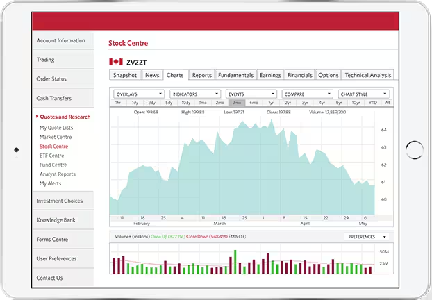
CIBC Investor’s Edge Stock Centre Charts
Integrating visible content with complex data feeds in a visual chart representation with an effective use of hidden content for screen readers.
 The amount of data feeding into the page in real time meant creating a content and visual design template to effectively present it. A broad range of user-defined variables meant the data could change in numerous ways, requiring the chart to re-render each time. The entire page had to be easy to understand and navigate without overwhelming the user. This meant the user experience still had to flow in a way that made sense, especially for screen reader users. If it didn’t, they could lose their place on the page if any of the data shifted and the chart rendered again.
Because the data modules didn’t share a size standard due to the different types and amounts of data they represented, tab order had to be very clear and logical. The order presented to a screen reader had to match the visual flow as closely as possible, which became complex due to the controls, tab series, and layered menus.
The chart was challenging because it was overseen by an outside vendor in the United States. This meant they weren’t required to meet the same accessibility standards as our design team, being in Ontario. I was required to find a way to deliver understandable, accessible content within the vendor’s willingness to do so, while still meeting the Accessibility for Ontarians with Disabilities Act (AODA) standards. The solution was a massive, complex table operating behind the chart. This table was presented to screen reader users while hidden from the typical user experience so the chart could be interacted with directly.
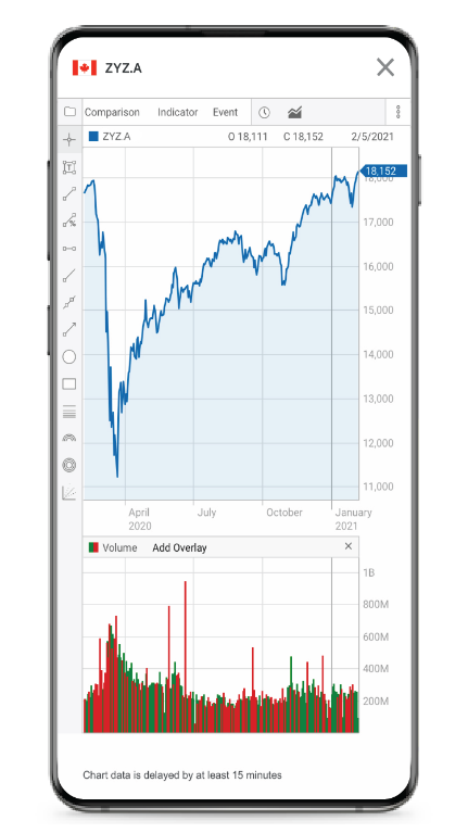
You can see from the attached screenshot of the mobile/small breakpoint how that compresses the chart. The many dropdown menus and tab options are replaced by button menus and switches along the left side. One of the design’s unavoidable consequences was a small touch area, so the charts wouldn’t be compressed further.